3 Cuban Poster Artists
Cuba’s cultural and promotional posters of today have both come of age and strengthened in a visible fashion, thanks to the leg up given by designers, experts, historians and institutions to this discipline of the graphic arts of undisputed and peculiar tradition in the country. A blessed rejuvenation with clear-cut vitality seen in recent years and into the new millennium.
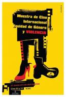
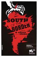
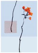
The work designed by designers Giselle Monzon, Michelle Miyares Hollands and Laura Llopiz is part of a daily going that has been laying the foundations for a larger bunch of poster makers who have no doubt clung to the esthetic and conceptual resources posters have to offer as their creative/functional/promotional materials of choice.
Graduated with degrees in Informational Design at the Higher Institute of Design (ISDI), Monzon (class of 2002), Hollands (2002) and Laura Llopiz (2000) have tried their hands at and grown in this new opening scenario. Their works can be easily singled out, however they all look to a relative formal and linguistic autonomy that puts wider possibilities on their fingertips. Thus, the contextual limitations and the graphic structure used by them are intertwined in artistic languages that move on beyond the plastic arts –though they are also included and blended. Their themes are basically likened to cultural events ranging from exhibits, movie and documentary presentations to books and a number of different festivals. They are mostly testimonial documents of these projects’ historic and visual memory. Their different pieces let us peek into a community of technical and artistic interests –painting, photography, typography, composition, illustration, publicity, performing arts, dancing, cinema and the like– that will be the promoters of the poster expansion into space, not an urban space but am expositional one.1
Monzon makes a constructive approach to experimental art due to the strategy he has conducted at the Center for Visual Art Development (CDAV) in Havana. Implementing the image of exhibits from this profile is no doubt the perfect hook to accurately delve into the artists’ needs for both expression and dialogue. Her contribution to the making of posters has been her objective; the graphic solutions are independent to the visualization of the project as a whole. She points fingers without apparent fear. She challenges and energizes everything with her proposals; she tackles the conception of exhibits as executed by the institutions.
For her part, Hollands’ posters are exquisite. The image, the typography, the elements used in the printing process that never kill the ideas, the gloating of the topics, the framework, the chapters, the motifs. The poetics unfold in a more baroque fashion. Her posters are by far gripping and piquing, especially the ones she’s been commissioned for the Cuban Institute of Filmmaking Art and Industry (ICAIC). Llopiz, in turn, prefers synthesis marked by minimal and concrete influences. Her appreciations on the discourse are usually succinct and clear. She storms in with a solution and she takes it all the way to the end; she relies on beauty and a symptomatic subtleness that captures the eye of the beholder. Her work as a designer for the Cuban League of Writers and Artists (UNEAC) has given her the opportunity to paint a coherent identity that is not at odds with the organization’s best interest.
The special harmony of these women’s productions as poster makers, their talent and sensitivity, have been the reasons of their recognition not only in their own turf, but also overseas. Their interpretations –characterized by originality, recycling, appropriation and mixtures– stamp signs of fascinating heterogeneity on their artworks that eventually buttress the coexistence of multiple creative currents in keeping with the materials they use.


