Identity crisis?
The objective was a characterization of the dance movement. The intention of preventing the project from falling into humdrum led to the use of countless variations, in a way that the manipulation of the brand’s components would render in an assortment of possibilities. In a bid to ease the use by customers, a vast handbook of identity, with nearly a hundred versions, was made.
A few years ago while I was reading one of the main Brazilian newspapers with a morning cup of coffee, a piece of news in the sports section struck my attention: “Metropolis Spooks Jacare Hunter.”* It was all about Edielson’s trip –a Karinu aboriginal born on the border between Brazil and French Guyana– who’d never flown on a plane nor walked on the big city before. He’d gone there to visit Latin America’s most populated city to play a soccer game pitting his team against a local squad.
And, what does design have to do with this? That design lays bare our identity, our history; and this particular event illustrates quite well how diverse and many-sided in terms of culture Brazilian society really is.
We are Latin America’s largest economy; we boast a total surface of over 8.5 million square kilometers, approximately 7,000 kilometers of coastlines, a population of nearly 200 million inhabitants and plurality in terms of ethnics and cultures. Unlike some countries where cultural diversity abounds but cultures don’t melt into one another, we do get mixed and the resulting religious eclecticism and hybridism become parts of our daily lives, thus giving way to an interesting and unclassifiable fusion. In my opinion, this blend is the key to success in the contemporary world because it does include culture-crossing.
Design, as a postulate of industrialization and productive rationalization, grew roots in Europe back in the 1930s, specifically in Bauhaus, and later in Hochschule für Gestaltung Ulm, the place that begot all major designers that eventually brought the teaching of design to South America. Today, scholars argue that the principles of modern design, the discipline construed as a science and all the underlying knowledge related to it –geometry, typography and the like– will get lost in favor of Americanized estheticism (the famous controversy between design and styling).
Back in the 1960s –the time when Brasilia was unveiled and enthusiasm for economic development was in full swing–different groups of artists and designers in search for a Brazilian identity as the main premise in the practice of graphic design popped up. Such boldface names like Aloisio Magalhães, Geraldo de Barros, Rubem Martins, Alexandre Wollner and many others are good cases in point. It was a moment of economic prosperity well reflected in design, architecture and the arts in general.
It was followed, though, by a black period stripped of perspectives in which we were invaded –until not too long ago– by an inferiority complex that made us copycat whatever hailed from the U.S: or Europe. We won our self-esteem back, yet we kept on looking, in this sea of cultural diversity, for possibilities we could call our own, expressions of what is genuinely ours, laying hands on intangible assets to build on our own wealth.
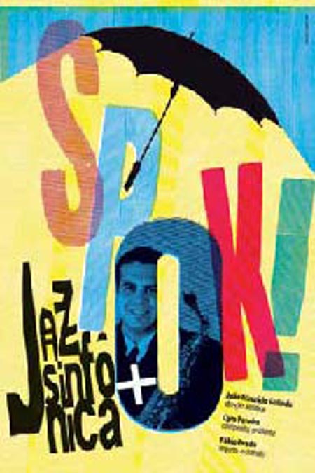
The images in this article are nothing but a sample of visual identity projects over the past four years, examples that illustrate something about the diversity of Brazil’s graphic design that has now embarked on a quest for emancipation and plural expression.


